Post by Deleted on Jan 15, 2019 2:56:34 GMT -5
[A Blast from the Past of PSF!]
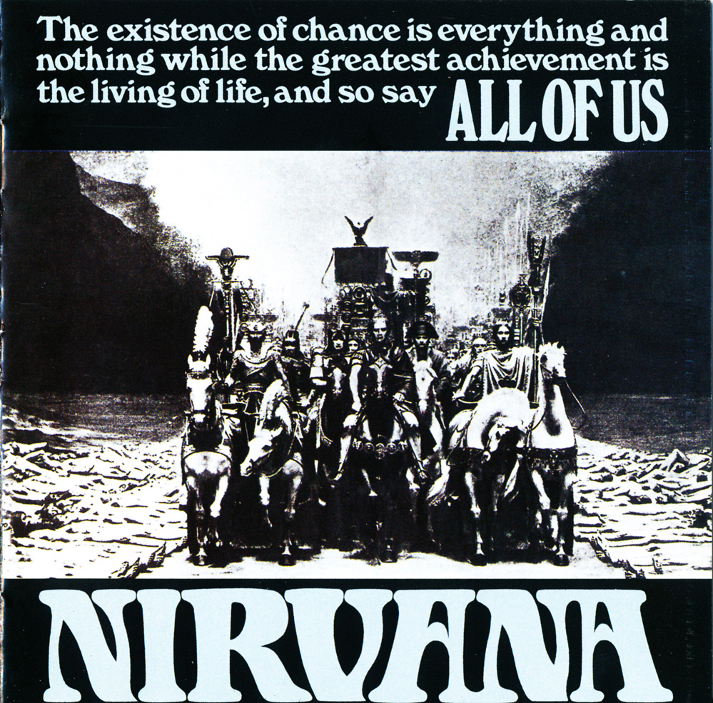
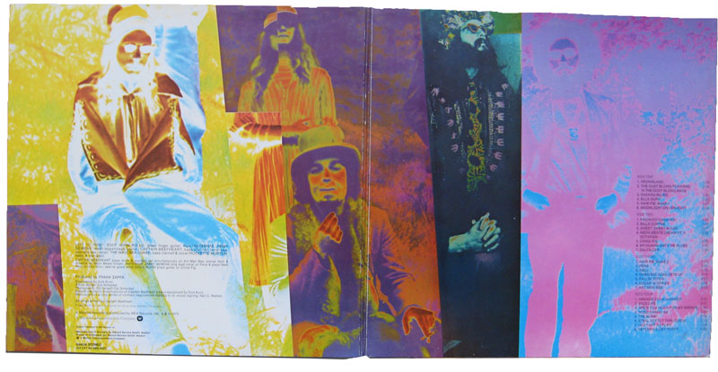
What are your favorite, least favorite, funniest, ugliest and most beautiful examples of cover art?
Any general thoughts on album cover art, post them here.
For myself, when it comes to my faves, I'd have to say Forever Changes, Sgt Pepper, In the Court of the Crimson King, Just a Poke and Procol Harum (their self titled debut) are my top 5. Cheap Thrills, Gandalf, Dark Side of the Moon, Smiley Smile and the Velvet Underground & Nico would round out my top 10. Forever Changes is so good it was painted on Arthur Lee's tombstone, and its the only album cover I'd ever consider getting a tattoo of. Sgt Pepper's cover is literally the best thing about the whole album.
As for least favorite, well the Beach Boys almost never had good covers. Pet Sounds is a terrible cover to an otherwise fantastic album. Their Satanic Majesties Request I think wouldn't have got nearly the flak it did were it not for the obviously derivative cover. Atom Heart Mother by Pink Floyd sucks, and might just be my least favorite from a major band.
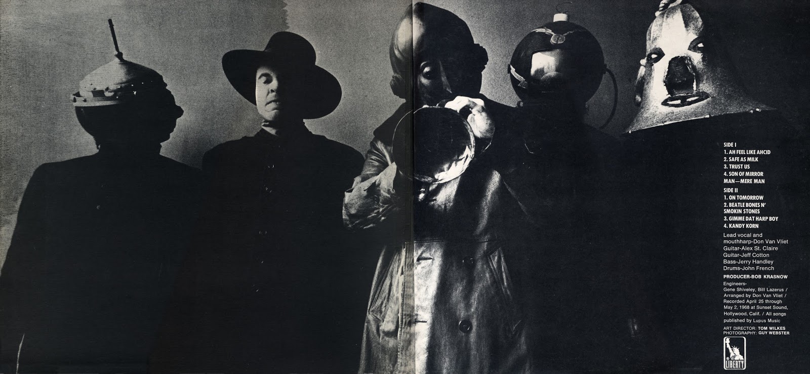
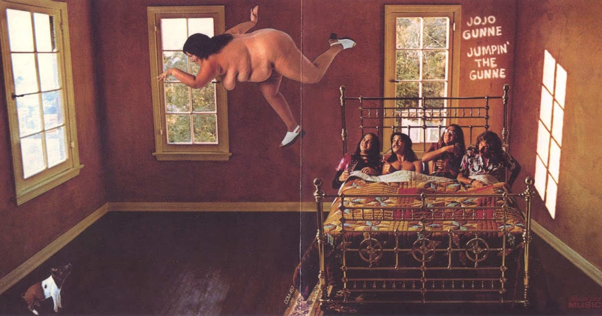
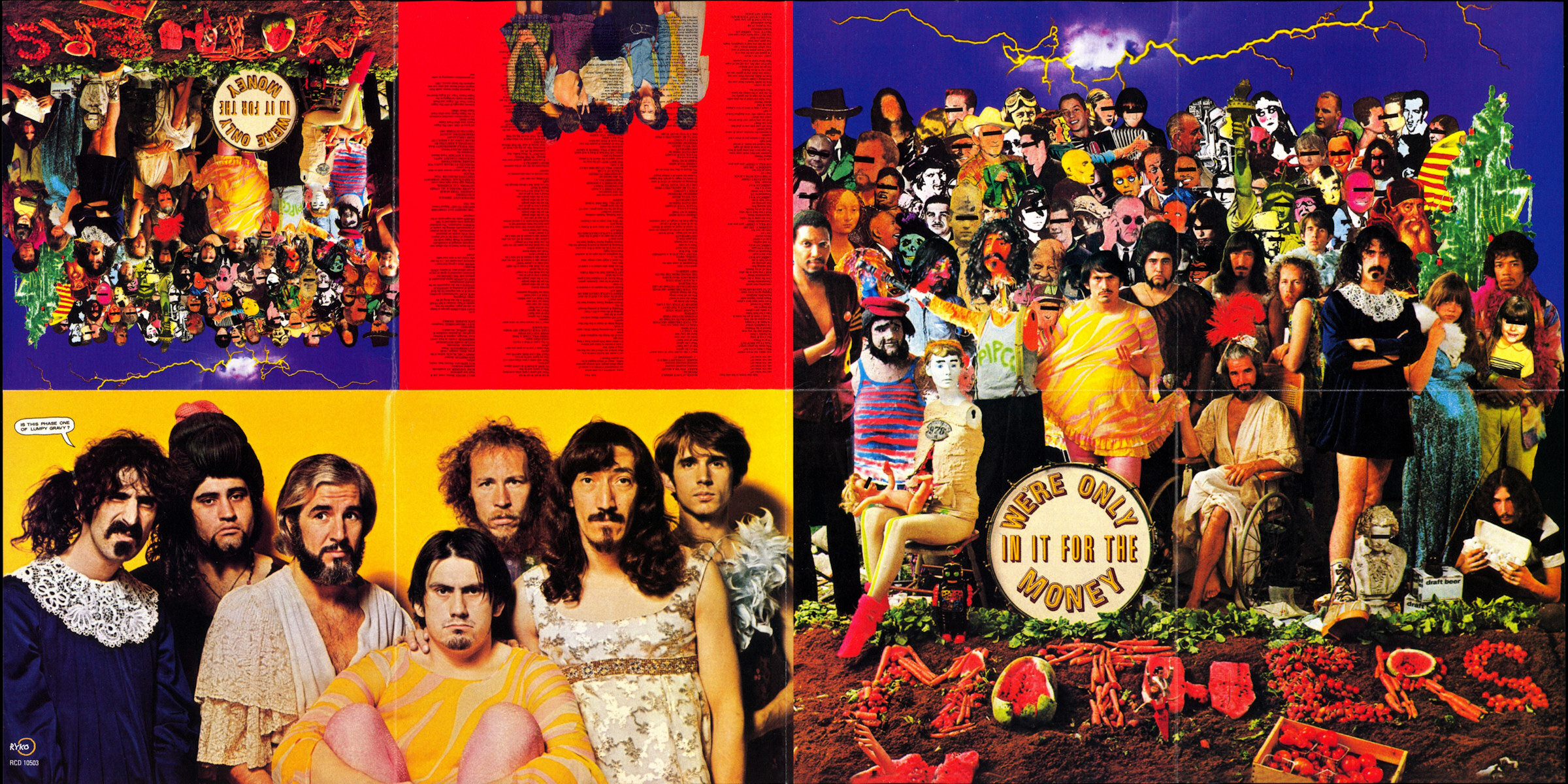
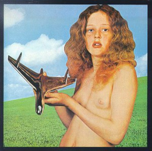
As for ugliest and most beautiful, I'd point you guys again towards these three photo albums I made HERE and HERE also HERE showing some albums Ive discovered over the past two years seeking buried gems from the psychedelic/progressive era. These encompass the most gorgeous and most bizarre covers I've seen though the albums themselves range in quality. My least favorite of these was Chimera--it just makes me feel voyeuristic, like Im looking at a personal photo I'm not supposed to be.
Some additional random thoughts on album cover art:
The Beatles should have used the original dollhouse cover for the White Album, though I'm glad they didn't use the Dollhouse title. Following up an album entitled with the name of a fictional band they were pretending to be with their true name is really profound to me. It's a lot like a psychedelic trip and its after-effects in fact, where a trip forces you to confront the things about yourself you don't like, your ego breaks down and in many ways you DO become a different person. Then, after the trip is over, you're still stuck being you, the person you were before the drug, yet you're changed too. As for the cover, I get what they were going for with the pure white, contrasting the colorful Pepper cover. But I don't think that was necessary nor do I feel it suited the music either. If Get Back had happened as intended, as a back to the basics record, the pure white would have suited that better in my opinion.
Jimi Hendrix got screwed over for his album covers more than any other artist I know of. In the first place, his first album's British cover was WAY better than the tacky US one. And the idea he had for Electric Ladyland being a picture of the band with some kids playing on an Alice in Wonderland statue is leaps and bounds cooler than the static image of his face and the gross topless chicks gatefold.
I prefer the black circular cover to the USA than the manila folder one which was its original. The black circle I think represents the band better and is more iconic. I think it's for good reason that caught on is what the album is shipped with now.
Generally speaking, I'm not a big fan of static shots of the band themselves standing still, looking into the camera as album covers. The exceptions being if there's some cool camera angle (think Rubber Soul) or camera effect (think Piper at the Gates of Dawn). There's nothing wrong with this, obviously, but the albums that stick out to me as iconic and gorgeous tend to be illustrations or imaginative pics/collages. The two exceptions to this off the top of my head, are MJ's Off the Wall and Jefferson Airplane's Surrealistic Pillow. Im not sure why, but I love those covers so much. MJ's facial expression has always stuck with me, and for SP I think it's just because they dont LOOK like hippies or rock stars. The glasses, the t-shirt, the traditional instruments (string, woodwind, NO guitar) just makes them seem like innocent students of music.
Even though it's not the "best" cover out there, and I admit I was disappointed with it at first, the iconic SMiLE cover has grown on me and become another favorite over the years. I think it represents the music inside perfectly, which at the end of the day is the most important thing. And it just looks so charming and cute. What it depicts, a friendly little neighborhood store where you can buy happiness, is both a beautifully naive idea or a scathing critique of American corporate consumerism. It may sound stupid or petty, but one of the (minor) reasons why I dont accept BWPS as the finished thing is because it's missing that all-important cover, and they couldn't come up with anything decent to replace it with, just text and a sun. Very lame, I have to say.


